The first version of Ginkgo had a very tidy information architecture. Items had types. Types had properties. Properties had values. Everything was structured. Everything was consistent. You could filter by room, sort by category, and search by any field you’d entered.
Users were not interested in it.
Not because it was hard to use. We had spent a lot of time on the interface. The problem was that entering information in the way the system required felt completely different from how people actually think about their belongings. It created enormous friction right at the start, before anyone had got any value out of it.
Here’s what we learned.
The short version
We were wrong about structure. We thought a good home inventory app needed clear categories, careful fields and a neat database. What people actually needed was speed, forgiveness and search that understood ordinary language.
That lesson changed the product. Ginkgo became less like a form to complete and more like a memory aid you can talk to.
People don’t think about objects categorically
We built a system that assumed people would want to categorise their belongings. Power tools, kitchen equipment, clothing, sports equipment. Neat divisions.
In practice, people do not think about their stuff this way. They think about it contextually. “The thing we use to inflate pool toys” is not a “recreational equipment / inflation device”. It is “that white cylinder that lives in the top of the garage somewhere near the garden stuff”. The category is almost irrelevant. The context is everything.
This meant that our carefully designed type hierarchy, which we had spent weeks refining, was essentially useless. People either could not decide how to categorise something, categorised things inconsistently, or ignored categories entirely and just typed descriptions into the name field.
The lesson: search has to work on fuzzy, contextual, imprecise descriptions. Not on structured data.
Adding things has to take under 30 seconds
Our original add flow required: item name, item type, room, optional description, optional photo. Five fields (or four), one of which was a dropdown.
Even this was too much. The friction of the add step determined whether people used the app at all, and we had underestimated how much people would abandon the flow if it felt like work.
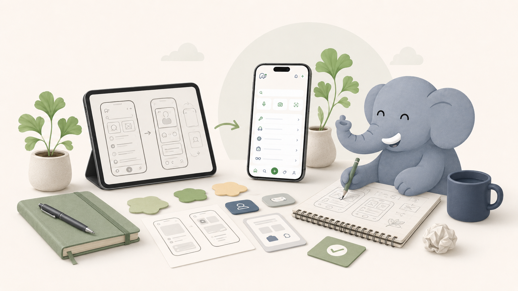
We tested different flows. The one that worked best: photo first, everything else generated. Take a picture, confirm the AI’s guess at what the object is, and accept the room it suggests based on your last location. Done. The name, description, and category are filled in automatically. You can edit them, but you do not have to.
This change, photo-first with AI-generated metadata, made adoption dramatically easier. The app felt like it was doing the work, not asking you to do work.
Household sharing is the hard problem
We built the sharing feature assuming it would be used to share an entire home inventory. In practice, people shared in much more varied ways: sometimes the whole home, sometimes a specific room, sometimes a project.
We also discovered that different household members had fundamentally different relationships with the app. The person who set it up used it actively, added things, maintained it. Other household members tended to use it passively. They would look something up, but they would not add or update.
This is actually fine. A household inventory that’s actively maintained by one person and used by everyone is still valuable. But it meant we had to think much harder about the passive use case: how to make search and retrieval fast and intuitive for someone who hasn’t spent much time in the app and doesn’t know the information architecture.
The answer, again, was natural language. If you can ask “where is the extension lead?” and get an answer, you do not need to know how the app works. That became the primary interface for casual users.
Privacy and trust take time to build
One finding that surprised us: some users were genuinely uncertain about storing information about their home contents in an app. What if there was a data breach? What if the company closed down?
These are legitimate concerns. We’d thought about privacy from a compliance perspective but hadn’t thought enough about it from a trust perspective. There’s a difference.
The changes we made: being explicit about what data we store and why; making export straightforward so users do not feel locked in; being clear about what AI processing happens and where. None of these are big features, but together they changed how users felt about the product.
Trust is harder to build than features and easier to lose. We are still learning this.
We had to design for low energy moments
This was another important lesson. People do not only use home organisation tools when they are calmly setting up a system on a Sunday afternoon. They use them when a child needs football boots, when the plumber is waiting, when someone is halfway out of the door, or when a rarely used adapter has vanished again.
That changes the product requirements. Search needs to work when the user is impatient. Adding an item needs to work when the user has ten seconds. The language has to feel familiar. The interface has to make the next action obvious.
In early testing, people did not want to admire the system. They wanted to get an answer and keep moving. That was humbling, but useful.
What the second version looks like
The current version of Ginkgo is significantly different from what we started with. Less structured, more conversational. Faster to add things, faster to find them. More tolerant of imprecision in descriptions, categories and the way people think about their stuff.
We are still building. There are parts of the product that do not work as well as we want them to. The photo recognition makes mistakes. The natural language search occasionally misses something obvious. The notification system is underpowered.
But the fundamental approach feels right now in a way it did not in the first version: make adding easy, make finding easy, and make sharing possible without requiring everyone to be active. Getting there required being wrong about a lot of things first.
That’s just how it goes.
Frequently asked questions
Why did the first version of Ginkgo not work?
It asked people to structure information before they had received value from the product. That made setup feel like admin, which is the fastest way to lose momentum in a home organisation app.
What changed in the newer version?
We moved towards photo-first adding, natural language search, flexible locations and household sharing that works for both active and passive users.
What makes a home inventory app useful?
It has to be fast to add to, easy to search, forgiving of vague language and genuinely useful to the whole household. If it only works for the person who set it up, it will struggle to last.